POSTED BY Primitive | May 4, 2022
Hundreds of years ago, books were written out by hand, copied onto paper by monks writing in frigid scriptoriums while they penned pages of flourishing script and beautiful images. Today, print is all around us: this blog, the book on your nightstand, the news article you read online.
While we now have more efficient methods of creation, we haven’t lost the ability to turn letters into works of art. In fact, a talented designer is able to think about type just as critically and creatively as they are other elements of design, such as colors and images.
When you think about branding your business or building out a marketing strategy, the type you use might not be one of your first considerations. But typography is one of those things that makes itself most known when it is used incorrectly. That’s why we're here with this beginning guide to typography. While it might not be the most in-depth option on the market, we promise it’s more than just an Arial view.
Everything that Goes into Typography
Just because we are surrounded by words in every aspect of our lives doesn’t mean we know everything there is to know about type or typography.
What is Typography?
When researching this blog, I did what I always do: spend hours combing through academic tests, books, and more ask my incredibly smart teammates. Our wicked talented UX Design Lead, Jeremy Giovannetti, (Italian for “knows everything about typography”) defined typography like this:
“Typography is the arranging of letters and text in a way that is clear, readable, visually appealing, and/or creative.”
When asked if he would write the rest of my blog, however, Mr. Giovannetti responded with a firm “No.” (Italian for No.)
Type vs Font
Armed with this helpful definition, I began to craft my first draft of this blog post. Only to realize that I had no idea the difference between a type and a font or a typeface. While these words are often used interchangeably, they aren’t exactly the same. So I went to our creative Senior Designers, Morgan Mann and Rayann Ragland, who helped me understand that:
- Type (also called typeface): describes a specific font family (for example, Times New Roman, Roboto, or Arial)
- Font: every possible configuration within a font family (for example, Times New Roman Regular, Times New Roman Bold, Times New Roman Italic, etc.)
While you won’t be wrong if you use these words interchangeably, it is fun to know exactly what is what. However, when I asked these two geniuses if they would be willing to share more of their knowledge by writing this blog, they responded with another firm, “No.”
Types of Type
Discouraged, I then proceeded to learn more about the different “types” or categories of typeface available. Typically, there are three categories:
- Serif: think Times New Roman or Cambria. These typefaces are easiest to read and are most often used in books and articles.
- Sans-Serif: the ones that shot the serif, like Arial or Helvetica (Neue). Still readable, but with more modern vibes, these typefaces are often used for websites and blogs.
- Decorative: think Wingdings, Permanent Marker, etc. While these typefaces are fun and cute, they should be used sparingly.
Elements of Typography
It’s not enough to know the different categories of typefaces that you can use. It’s important to understand the different elements of typography to know how to use type (or typeface, or fonts) to aptly communicate with your audience.
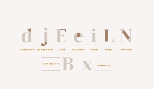
- Arm: a horizontal stroke of a letter that is unattached on one side.
- Ascender: part of a letter that rises above the x-height.
- Cap height: the height of a capital letter.
- Counter: a partial or fully enclosed space in a letter.
- Descender: part of a letter that drops below the x-height.
- Kerning: the spacing between individual letters or characters. (Varies based upon the typeface and font you are using.)
- Stem: a straight vertical stroke.
- Stroke: a straight or curved line (so basically every aspect of a letter).
- X-height: the height of lowercase letters (not including the ascender or descender)
Art and Science: Why Does Typography Matter for Good Design?
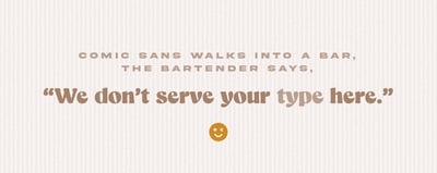
Why does Ponce de Leon insist on using Comic Sans? Because it’s the font of youth.
Using the wrong font is as funny as a comic…sans humor.
As we mentioned above, typography is something we are exposed to in every aspect of our lives. Because we see it so much, we often take good typography for granted. But, this exposure also makes it crystal clear when a brand misses the mark with its typography.
Nailing the typography you use for your branding involves both art and science – the ability to be both creative and analytical. Here are some of the impacts typography has on your branding, and how you can avoid embarrassing mistakes.
- Brand consistency and recognition. Choosing the right typeface is a strategic choice that is important to your overall design and aesthetic.
-
- The art: Think about how you want your brand to appear to your audience. How do you want to be known or perceived? If you want to be educational or authoritarian, you might select a serif font. Regardless, it’s critical that your font is a true representation of your brand.
- The science: How does your audience actually respond to different fonts? Don’t be afraid to actually ask your customers for their opinions. When they view your website and logo, is your brand memorable to them? (Hint: unless you are designing for young children or your niece’s lemonade stand, steer clear of Comic Sans.)
-
- User experience. You must choose typography that has a strong design appeal. But you must also choose a type that is easy to read and follow for your audience.
-
- The art: So many fonts offer form and function. Jeremy shared that his current favorite is Recoleta – a subtle font that is not quite serif, but not quite sans serif.
- The science: Again, choosing a type that is both whimsical and easy on the eyes requires technical knowledge of design and typography. This isn’t the kind of thing where you just get lucky. You have to know your type and your customers’ needs.
-
- Decision-making and lead generation. It’s great to use typography to have a sleek web design, or to help viewers recognize your brand anytime they see it. But your typography should also help earn your viewers’ trust – by tastefully guiding them through your site or content until they click on a call to action.
-
-
The art: Most websites or branded images use a combination of fonts. How can you combine a more eye-catching font with simpler ones for a cohesive look that doesn’t leave viewers dizzy?
-
The science: Where do you want to draw your viewers’ attention? How will you use typography to help their eyes flow where you want them to go?
-
-
Worth the Type: Important Considerations with Your Typography
Just because typography can be a small thing doesn’t mean it has a small impact. To make sure you get it right, keep these things in mind.
- Balance: Don’t overwhelm your readers with tons of creative fonts. Instead, use them intentionally to draw attention where you want it to be.
- Contrast: One thing that’s amazing about having so many “types” of fonts is that you can use them in contrast in order to add intrigue and personality. You can mix bold and light type, serif and sans serif. Pair one strong font with sleeker ones, or a creative font with something more streamlined.
- Hierarchy: Along with things like contrast, your text’s hierarchy is an important consideration. You see this every time you read a blog or an email that uses headings: it’s just an easy way to help your reader focus on the most important information.
- Use of white space: So far, our discussion here has almost exclusively involved the actual letters in typography, but white space is a critical element. How you space your type, both horizontally (kerning) and vertically (the space between rows of text), will impact how your audience views your design and where they place their focus.
- Alignment: Will your text be centered, fully justified, or aligned on one side? It’s a small thing, but it makes a difference.
- Readability. No matter what kind of type you are using, it must be legible. Sometimes brands choose a font that looks cool, but is difficult to read. Or they will try to arrange text in a way that looks cool, but makes it hard to know where to begin (for example, if you put text in a circle, etc.). Make things as easy as possible for your audience.
- Personality and emotional reaction. Just like colors, fonts make people think certain things. Knowing your brand’s personality will help you know which fonts are the best fit.
It goes without saying (which is why we’re typing it) that typography has a significant role to play in building your brand. But it’s also clear that doing this well goes far beyond just clicking on a font in your Google Doc. It requires an in-depth knowledge of your brand and your customers, as well as different types and how to integrate them into the design.
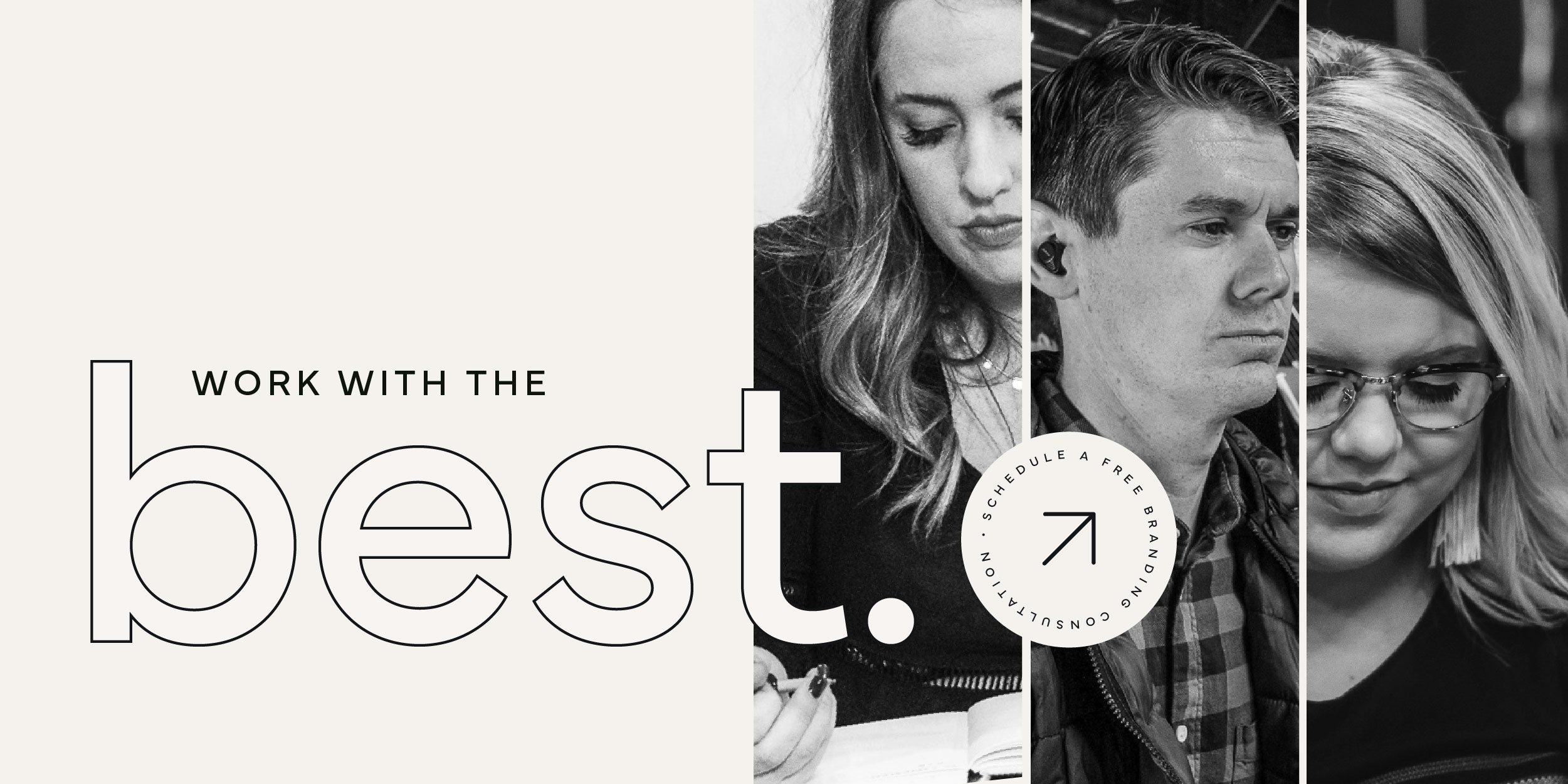
While you can try and figure it out on your own, you could also just click the image below to set up a meeting with our amazing team – people like Jeremy, Morgan, and Rayann. And while they won’t do any blog writing, I can assure you that when asked if they can help design your website or branding, the answer will be a firm, “Yes!”
SHARE THIS POST:
About the writer, Primitive
The team behind On the Dot. is made up of creatives, strategists, and developers who give a damn. At Primitive, we craft digital solutions that help businesses grow from brand to backend. Every insight we share is backed by strategy, driven by results, and built to move your business forward.