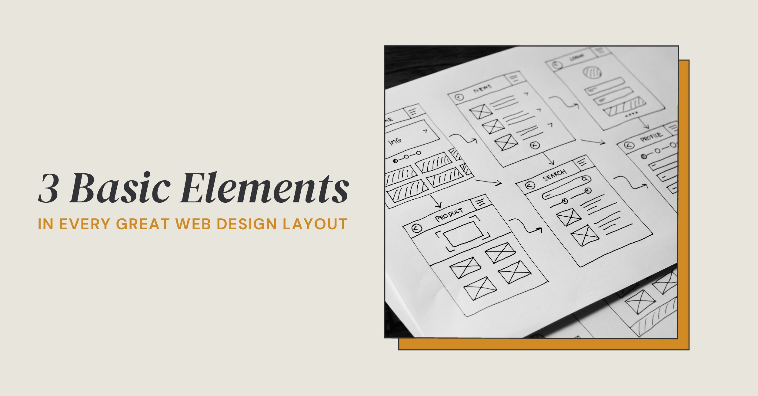
POSTED BY Primitive | Jun 16, 2021
A great web design is both user-friendly and flexible, even when face-to-face with changing trends and technologies.
Luckily, in the modern world of web design, website layouts are not only advancing themselves in the artistic realm, but deepening their stake in both method and logic.
This makes the art and science of a great web design layout easily replicable, and we’re here to explain it all.
Easily Identifiable Brand
Say that three times fast.
Okay, we know that’s a mouthful, but it’s super important.
Hearing the word “friction” in marketing is almost like hearing the name “Voldermort” pop up in random conversation. It causes a chill down your spine and immediately makes you wonder if your website is headed for disaster.
But, there’s a super simple way to avoid friction in your website design that makes your brand easily identifiable: be obvious.
No, this isn’t a trick answer to a trick question.
Although it’s a no-brainer that your audience is intelligent, friction is caused when we make them think harder than necessary.
So, when you initially begin laying out your website, make sure you don’t neglect the basics – your brand logo, colors, and fonts.
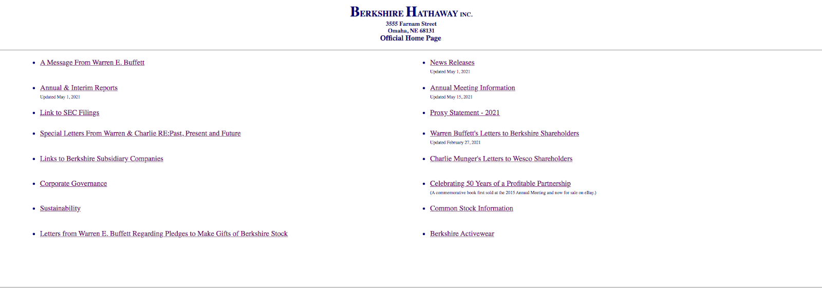
One example of a brand who could use a logo update? Berkshire Hathaway.
Although Warren Buffett is worth a cool $108 billion...with a “B”...his website tells the user nothing about the company. Simple logo aside, the website doesn’t even have an About Us page to help the user understand what they’re looking at.
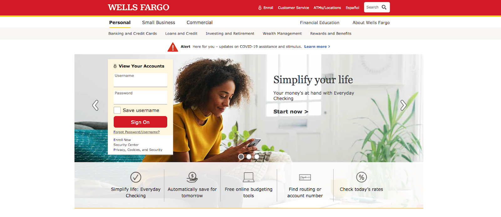
Now, in direct opposition to this website is the global financial institution, Wells Fargo.
Not only do they have an “About Wells Fargo” link above the fold, the visuals and copy on the website make it easy for the web visitor to understand this is a financial institution designed to carry out the mission of simplifying the lives of their clients.
Not sure if you need a full rebrand or a new logo? Visit our blog Full Rebrand vs Logo Redesign to find out.
Clear Navigation
This second point piggybacks off of the first one, and you’ll see why.
Just like mentioned above, web layouts and friction are like oil and water – they don’t mix. So when presented with the option to test your users’ patience vs...well, not...our professional opinion gives a vote for the latter.
The best way to achieve this is by making sure your website layout eliminates as many question marks as possible for the user.
Or, stated another way, is intuitive.
Take, for example, Google’s parent company, Alphabet.
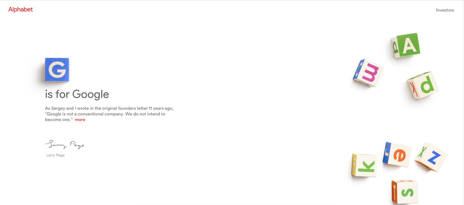
Like...what?
Although the web design is visually appealing and has excellent use of white space, I have so many questions.
I don’t want to know more about their investors, I want to know what exactly it is they do and why they do it.
And that’s exactly what friction is.
It’s questions that almost certainly compound into frustration, which leads to users bouncing into the arms of the competition.
Web visitors expect instant gratification. And as attested by my response to Alphabet, so do I along with, arguably, most of us.
Now, take a look at a company like Primitive.
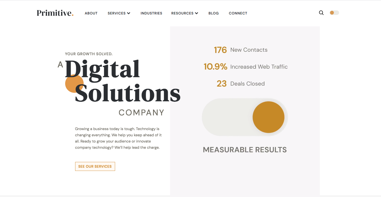
Although a service-oriented company (compared to a product) can have a bit of a difficult time expressing their value to prospects, it’s certainly not impossible
Web visitors need to know what it is you do and how you provide value to them almost instantly, or else they’ll never stay on your site.
So, one of the simplest and easiest ways to counter friction is to ensure that everything the user needs to browse your site effectively is located above the fold, like above. That means your navigation should exist before your user does any scrolling at all.
If the user is interested in learning more about the teasers you presented in the navigation, then they can decide to begin the exploratory process.
Visual Hierarchy
Unlike reading a book (left to right in America) most websites are designed to be viewed from the top down.
However, even equipped with that knowledge, it’s important to remember that most web users don’t view a website layout in that order. In fact, most website readers don’t read websites at all – they scan.
And that has a LOT to do with the visual hierarchy a.k.a. the strategy of your web design.
A website is a wealth of brand messaging and information. Your organization is capable of directing a specific message to a specific audience based on the hierarchy of your visual elements.
That makes prioritizing your message critical for your website layout.
Take, for example, Arngren.net
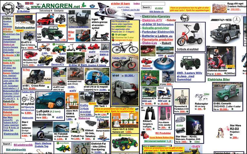
I hate to sound like a broken record, but...what??
The visuals are chaotic and there’s zero rhyme or reason for the user to understand what the brand is looking to accomplish with this site.
However, in stark contrast to this anxiety-inducing website is Apple’s website featuring their AirPods Pro.
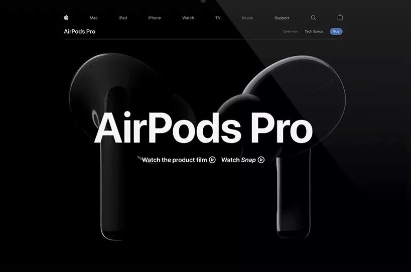
Now, Apple has a slightly unfair advantage in the sense that it’s been in both the technological and cultural canon for decades; however, if it ain’t broke, don’t fix it.
Their layout is minimalist, sleek, and easy to navigate. Once the user enters the website, they understand the product Apple is promoting and are invited to either “Watch the product film” or a story with the product as the focal point.
When comparing both website designs (Arngren vs Apple), the user inherently encounters two vastly different experiences, and I’d be hard-pressed to think many would opt for the former if given a choice.
Although web design falls within a range of simple to trendy and complex, having a website that has a great layout all boils down to two things: honoring your audience and respecting the basics.
Eager to learn more about the web design process? Visit our blog Q & A with a Website Designer: Morgan Mann
SHARE THIS POST:
About the writer, Primitive
The team behind On the Dot. is made up of creatives, strategists, and developers who give a damn. At Primitive, we craft digital solutions that help businesses grow from brand to backend. Every insight we share is backed by strategy, driven by results, and built to move your business forward.