POSTED BY Danielle Holmes | Apr 14, 2020
There are two ways to think about your website: proof of life for your business and a 24/7 money maker. And while it is good to have proof of life (and proof you’re not a scam), your website should be more. So ask yourself, “Is my website working for me 24/7? Is it an asset that doesn’t need sick time or vacation?”
“Is my website working for me 24/7? Is it an asset that doesn’t need sick time or vacation?”
If you’re answering no, you’re missing an opportunity. You’re missing leads. You’re leaving revenue on the table.
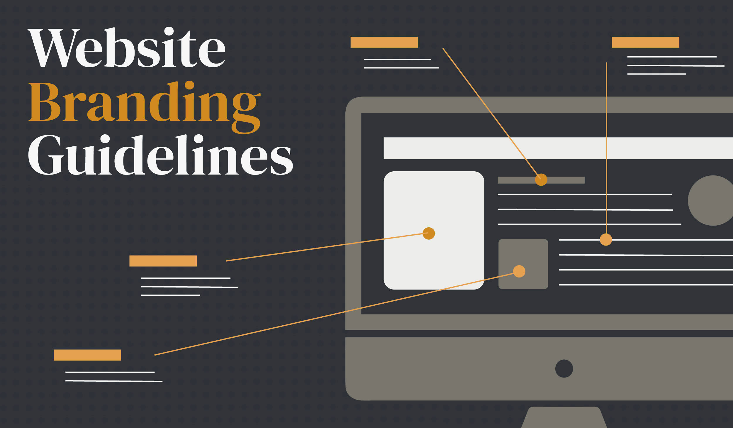
And while there are many parts to an effective website, we’ve got the visual branding guidelines to level up your website.
What is Visual Branding?
Visual branding is all the elements that visually communicate a brand’s values and personality. At Primitive, we include logo, typography, colors, images, layout, and other graphic elements.
And it matters. Logos, colors, images, and typography aren’t touchy-feely art and design terms. They’re a vital part of a successful, modern business. Forbes says the data backs what design experts have been saying all along:
- Mobile e-commerce accounts for at least 54% of all online sales
- 38% of users stop interacting with unattractive website layouts
- Color improves brand recognition by 80%
- Consistent brand presentation increases revenue by 23%
Now that you’ve seen the stats and done the math for your business, let’s talk about our expert-curated visual branding guidelines.
Expert-Curated Visual Branding Guidelines for Your Business
Logo Guidelines
Your logo may be the most recognizable part of your brand. And depending on your product or service, you, your potential customers, and current customers will have eyes on it regularly.
What is a logo?
A logo is a symbol made up of text and other visual elements that identifies a business. A logo created with expertise shows what a company does and what the brand values.
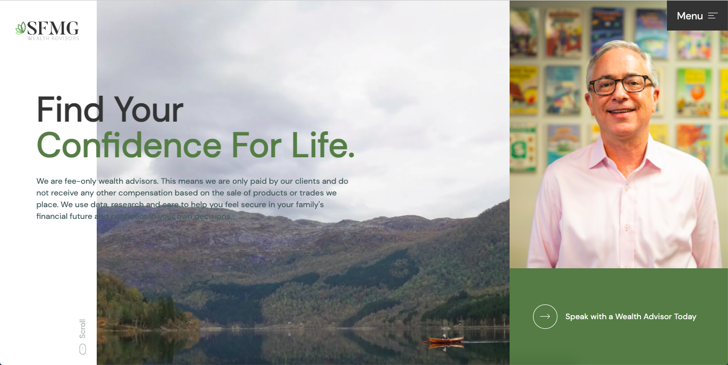
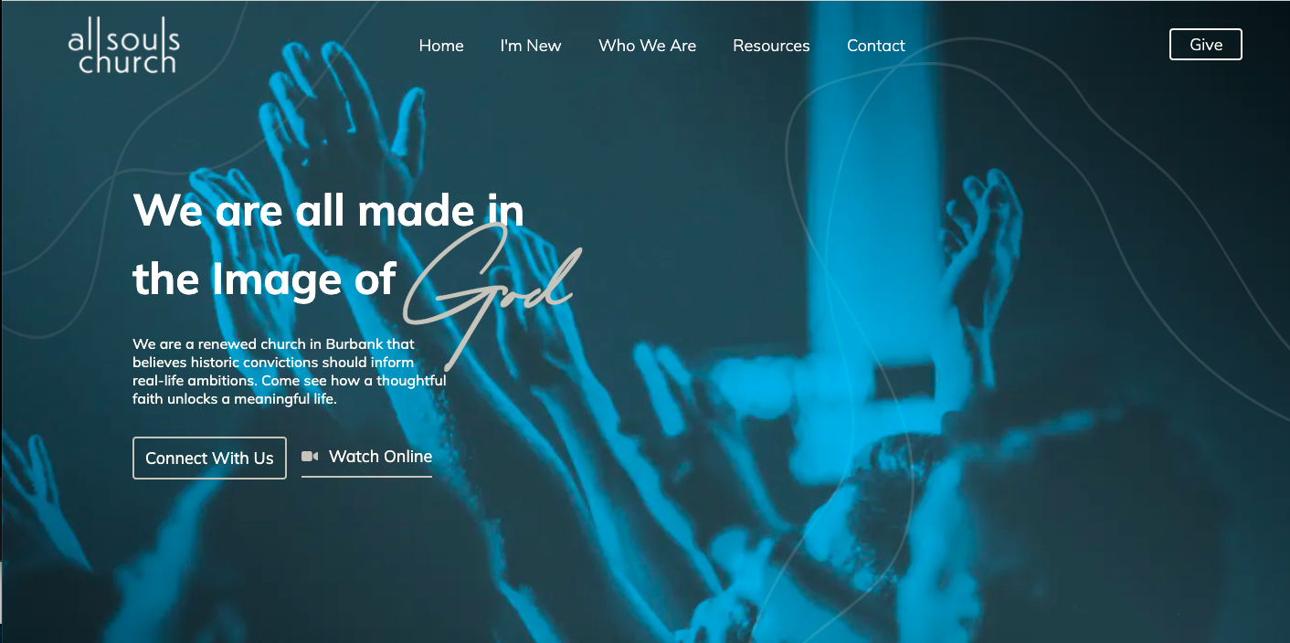
Keep It Above the Fold
You want your audience to be able to identify your brand by simply looking at a high-quality logo. So, keep it above the fold on your website. For the non-web designers, above the fold means it’s in the top half of the page layout.
Have Two Versions
Depending on your logo usage and mobile display, having a logo display vertically and horizontally is critical. Take it from us, you don’t want to cram the horizontal version in a vertical space.
Make It Work in Dark Mode
Make sure your contrast and shape overlap works in dark mode. Industry experts say dark mode is here to stay, so make sure your logo looks great in dark or light mode.
Size Your Logo Appropriately
We may be headquartered in Texas, but we’ll be the first to tell you that bigger isn’t always better. You don’t want your logo to overshadow valuable text content or compelling images.
Color Pallette Guidelines
Let’s get serious about color. There’s an entire field devoted to how color impacts us and our decisions. And when you’re a business owner or looking to increase revenue, you can’t afford to ignore how color impacts buying decisions.
What is a brand color palette?
A color palette is the collection of colors used across a brand’s collateral. Your brand identity color palette creates a vibrant visual experience with your target audience and showcases your brand’s unique personality.
Choose a Color That Matches Your Brand Motivation
Both academic research and current market research tells us that color changes how people feel and act. Whether it’s red and yellow making you feel hungry and safe or blue invoking serenity—it’s real.
- Red - Passion, drama, comfort
- Orange - Fun, freedom, enthusiasm
- Yellow - Optimism, energy, happiness
- Pink - Compassion, motivate action, energy
- Blue - Trust, honesty, relaxation
- Green - Safety, harmony, stability
- Purple - Imagination, inspiration, wisdom
- Brown - Stability, natural, warmth
- Gray - Neutral, formal, mature
- Black - Authority, mystery, discipline
Don’t Overuse a Color
You might choose a core color—like green—to be your brand’s main color. But, you don’t want a website that’s all green. You’ll need complementary colors in the same color family and accent colors. A grouping of colors will keep your website fresh.
Stay Consistent
Don’t forget that stat on how consistency helps people feel more comfortable with your brand. Document your chosen colors so anyone working on your website—or other platforms—can keep it consistent. We include a brand color palette in our style guides.
Website and Blog Image Guidelines
Images convey emotion and meaning that words can miss. The types of images that you use in your blog posts and website can change how a potential customer sees your company.
Avoid Stock Photos
Photos of your business, employees, and products or services perform better. In an era that values authenticity, people know what images are stock photos. And while they may not write your brand off for using stock photos, the bond with your brand won’t be as strong.
Consider Hand-Drawn Illustrations
Don’t have access to a photographer? Consider hand-drawn illustrations. Illustrations can be unique to your brand, have consistent style across your website, and set you apart from competitors.
Know Your Audience
Memes and GIFs can be very relevant, fun, and fresh. But they may not work for every audience. Market research and developing personas will help you know if your audience will come back for more.
Website Layout Guidelines
Websites follow the same basic rule as any other work of art. People’s eyes usually travel the same way they read (left to right for many languages) and clusters of three are visually attractive. Just like any other piece of design, there’s a lot that goes into website layout. But these are our website design guru’s biggest takeaways.
Key Info Goes Above the Fold
This is common sense. An average entire web session duration (from opening a tab to closing) is 2-3 minutes. So, your reader may be spending less than a minute on a single web page. Make sure the who and what of your brand—and how to contact or buy—is the first thing a viewer sees.
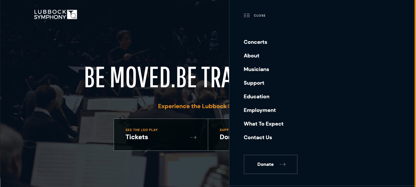
Use Clear Navigation
Good UX means your customer can get to where they need to go on your website, with minimal clicks and frustration. Whether you’re using a navigation bar in your header or a collapsible navigation, make sure relevant pages are listed.
Don’t Abandon Visual Hierarchy
Trends come and go, but our brains see things the same way. We’re keyed to recognize larger fonts and images convey more important information. We also expect information to be linear or in chronological order. Don’t ask your potential customer to do more work than they need to.
Visitors generally view websites in the same manner they view content – from left to right, up and down. With that in mind, your website’s layout can tell your visitors a lot about your brand. Understanding where the hot spots on your website are will help you identify the best placement for brand-identifying/enhancing images.
KEY VISUAL BRANDING TAKEAWAYS
-
Be consistent – Consistency throughout your website is vital to branding your business. Consistency helps users feel more comfortable. Comfortable users are more likely to hit buy.
-
View your website as a user – A big mistake is failing to look at a website from a user’s point of view. Design, content, and development should all work for the user.
-
Know your brand – This is something that may seem like a no-brainer, but it’s easy to dilute a brand over time. Personas, style guides, and messaging guides can keep your team on the same page.
-
Document everything – You should be keeping track of all your brand preferences. A working style guide is necessary for any brand putting out content.
So, we dare you to take the leap from a proof of life website to your marketing team MVP!

SHARE THIS POST:

About the writer, Danielle Holmes
Danielle has been telling stories her whole life. And for the last five years she’s been telling the stories of entrepreneurs, small businesses, and companies bringing quality products and services to customers. Danielle got her start in academia. With degrees in English and anthropology, she spent more than half a decade learning how to ask questions, tell stories, and do thorough research. Her approach uses ethnographic interview and coding techniques to better understand brands and clients. She listens for key words, recurring topics, and core ideas to know the client and their ideal audience. She uses that data and understanding to tell stories—true to brands—that create loyal customers.