POSTED BY Primitive | Jun 2, 2022
One of the ways the digital world mirrors the physical one is in the rapid changes in design. Every year, we find ourselves embracing unique trends, different styles of jeans we swore we would never wear, and colors and patterns that are different than ever before. Change is almost as inevitable as the fact that you will probably find yourself wearing lime green this year.
And this change hits online just as hard as it hits your closet.
In the same way that the 90s or early 2000s are making a comeback in fashion and style, we’re seeing a complete topsy turvy with web design today. While some things are stunning, some make you shake your head, and some make you think “huh,” they all serve to push design to be different, newer, and in many ways, better.
Why Web Design Trends Matter
Look. It’s clear that you can’t just embrace every single new design that hits the internet. Not only would that be expensive and time-consuming, but the results would also be about as chaotic as when you just mix all the paints in a box together.
But, understanding the different trends in web design is really significant, for a few reasons.
-
You gain a clearer understanding of you visual brand "style."
- An integral part of nailing the visual elements that make up your branding is consistency. This requires you to know exactly what you are, and what you are not. For instance, black walls are really having a moment in home decor right now. But that trend isn't for everyone. Sometimes you just have to see it to know if it's a fit.
-
You can stand out from your competitors.
- If you’re a financial firm wanting to update your website, you might look at all of your competitors’ sites and realize that each one follows a very similar pattern. Rather than just doing more of the same, you can look at new design trends and find something that helps set you apart to be unique and different.
You can build a site that's engaging and attractive.
First impressions are just as important online as they are in person. And if you don’t make a good one quickly, website visitors are going to bounce to another site that is more visually appealing and engaging. This means your visitors have to be able to tell, in less than a minute, that your site is where they want to find their solution. And while a slick site isn’t a guarantee that they will like what they see and stick around, it definitely helps.-
And, you can have a little fun.
- It’s great to see how creatives are constantly pressing boundaries and creating new and exciting things. And when you take the time to view creativity in action, it often inspires more creativity in your own work.
What are Current Web Design Trends?
With all that in mind, let’s dive into some trends that are just feeling 2022. And yes, this took a collaborative team effort from our Prim Pack experts.
Gradients
The number one mention from our team on web design trends for 2022? Gradients. But according to our web developer, Matthew James, not like the old school gradients that we used to use with our Word Art in PowerPoint presentations. Matthew says these gradients are smoother and cleaner, with a modern look and feel.
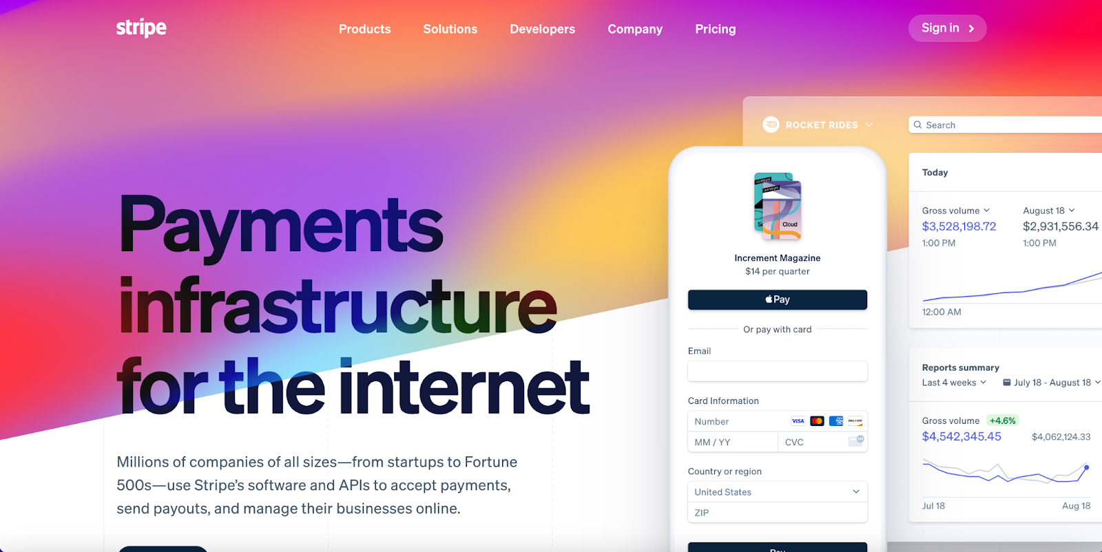
Gradients involve the mixing of two (or more) colors that are blended gradually. It’s a soothing result and makes for a unique background. You can see this in action on Stripe’s website. Not only is the background a bright, sleek gradient, but the pattern shifts and changes subtly.
Bold Colors and Fonts
Web designer Morgan Mann shared that swim trunks aren’t the only thing getting an upgrade in brighter colors this year. Websites are going full steam with bright colors and fonts that are unique, fun, and bold.
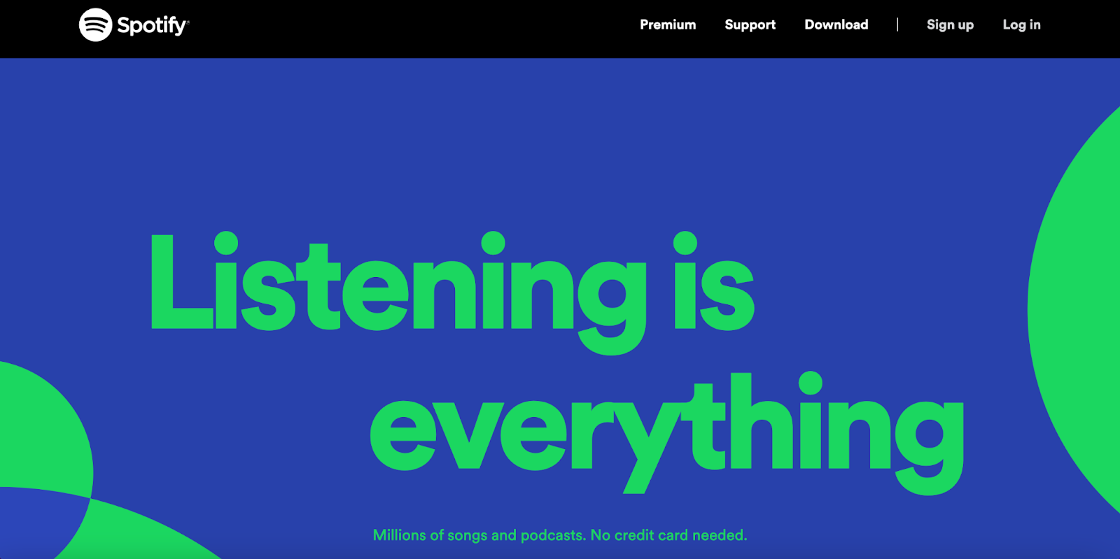
Spotify’s home page is simple, but bright and fun. The bright colors and thicker font draw your eye to the absolute heart of Spotify: they want you to listen. Whether it’s playlists or podcasts, Spotify exists to delight your ears.
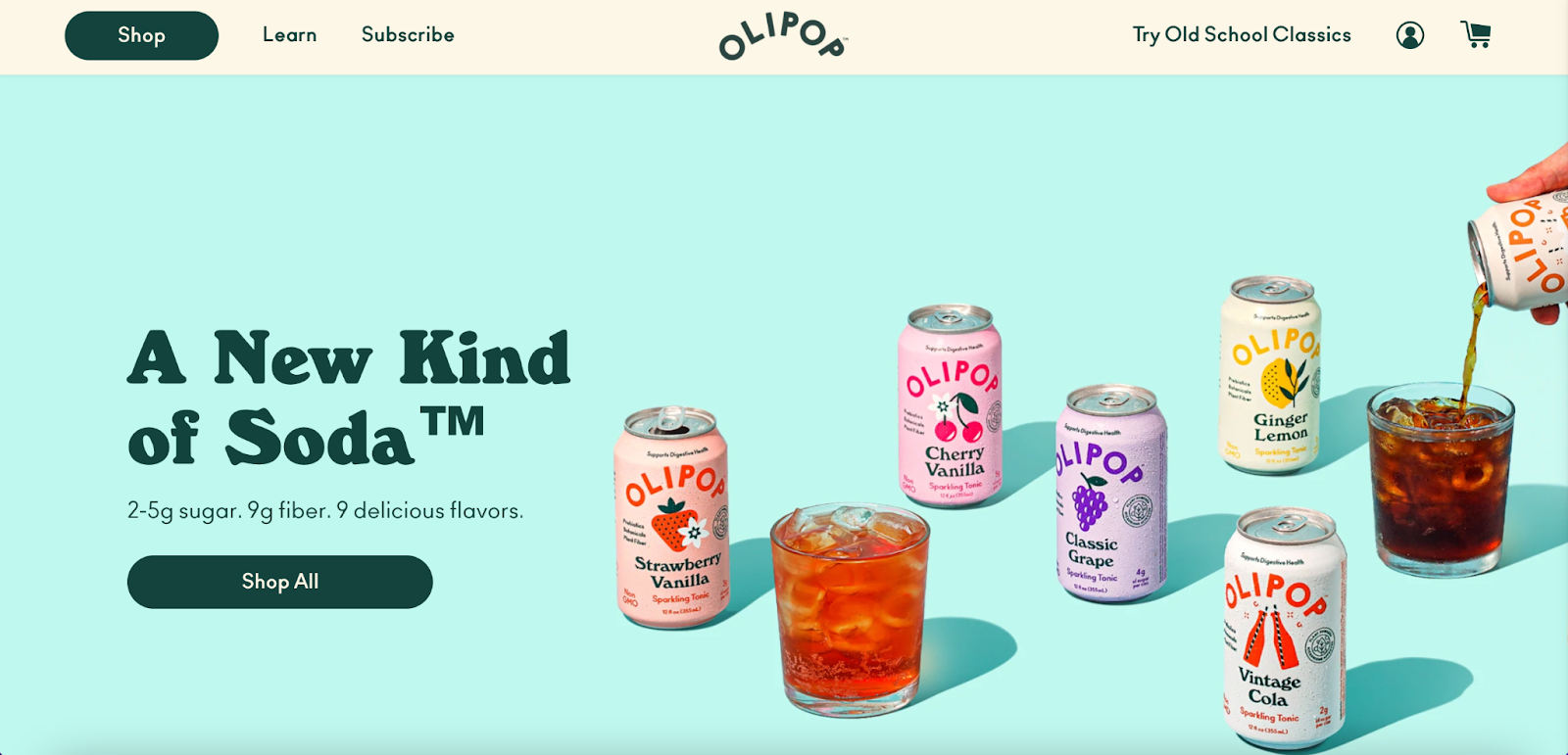
Olipop soda’s branding plays on vintage soda pop design, and its homepage reflects both the bright colors of that style and the fun, retro fonts. Your eyes first focus on the bright, delicious “pops” and then on the button to shop for them.
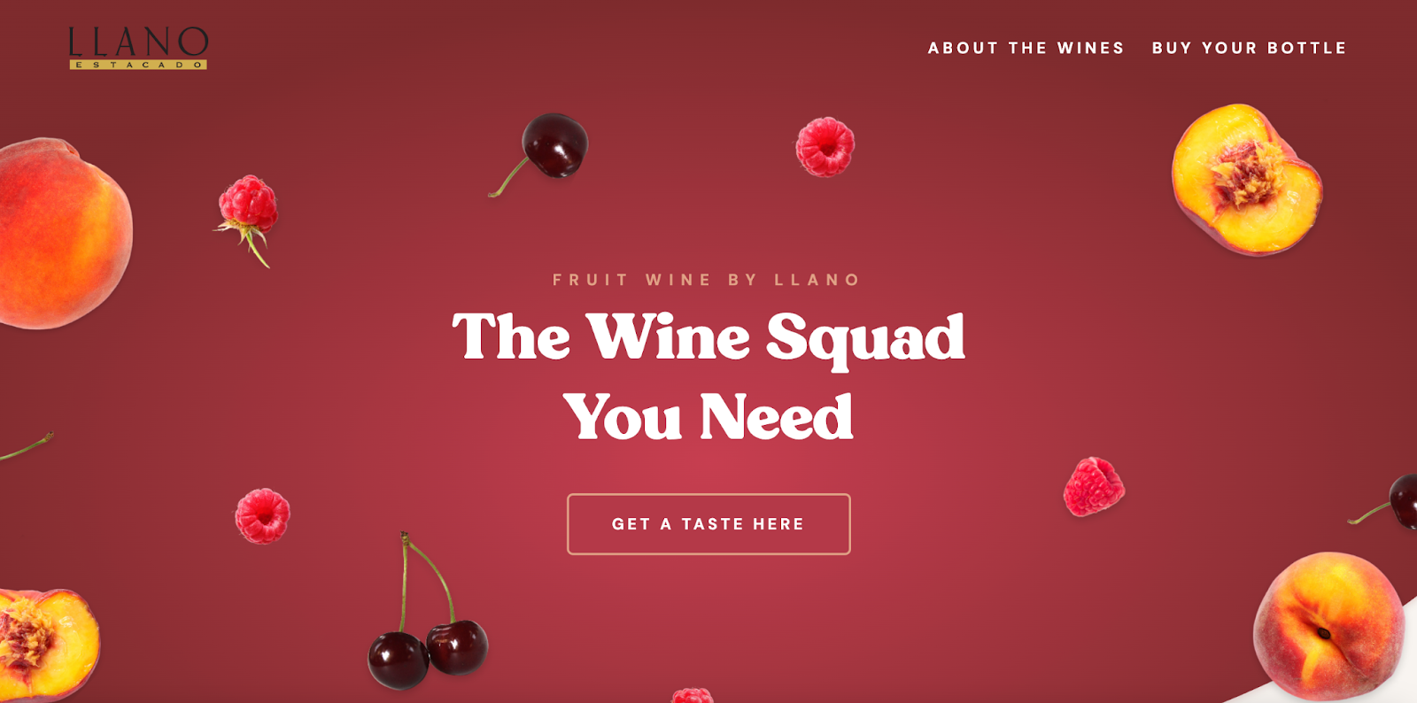
When our team built out the page for our client’s new fruit wines, they really uncorked some amazing combinations. We knew that the design had to fit the current branding, but also exhibit the fun, fresh, fizzy feeling you enjoy with every sip.
The combination of a bold, playful font with the bright colored fruit absolutely brings to mind gorgeous summer evenings with a crisp, refreshing glass of something delightful. Sip, sip, hooray!
Glassmorphism
This is a unique trend that is gaining in popularity. Glassmorphism is exactly how it sounds: design elements that mirror glass. These elements can be transparent, frosted, or glossy, and add depth to your site.
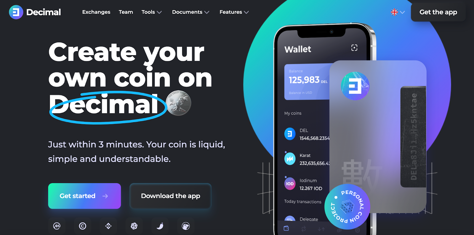
You can see glassmorphism on Decimal with the credit card shown in front of the phone. Because the card is translucent, it keeps the stack (the personal coin project button, the card, and the phone) from feeling overwhelming or difficult to read.
Shapes and Space
While web design trends in 2022 involve many of the elements that make up a website, we’re also seeing big changes in the overall layout of sites. Photography is dominating less of the hero space, leaving it more open for bold fonts as well as abstract shapes.
Our web developer shared how he has been seeing this trend lately. “More and more sites include aggressive angles or relaxing curves that help separate sections or elements.”
Morgan echoed this sentiment and also noted that many sites are allowing for more free flow in the overall design. Sites that were once dominated by a large hero image are now making space to let fonts and fun elements shine. More than ever, design trends seem to be kissing the rules goodbye and focusing more on fun, bright, positive, elements, like the homepage of MarketWise.
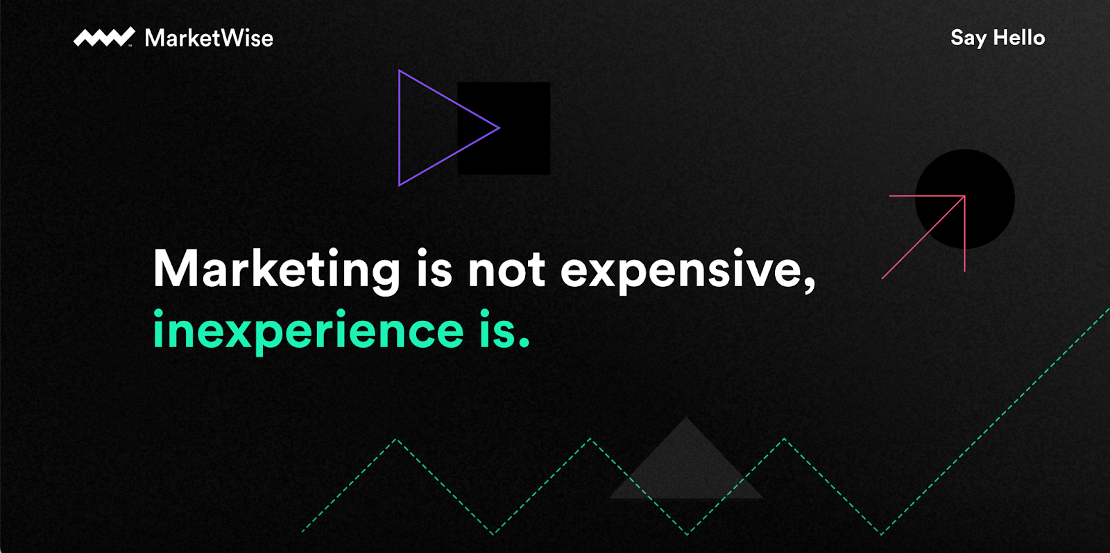
The subtle animations here also add to the whimsy of the site, while the black background reminds you they still keep things serious.
Animation
Like Crocs, this is a trend that has been around forever but is making a solid comeback. Brands are finding subtle ways to animate small aspects of their site. Not only does it look sleek, but it also grabs and holds a user’s attention. When placed intentionally, this animation can drive your audience’s eyes right where you need them to go in order to convert.
Wondering what we mean? Check out our newest site, Dark Horse Collab, to see it in action.
Accessibility
This is not a trend, but more of an expectation. Your site must be accessible to all users. Some things to keep in mind:
- Make things easy and clear to see. Monotone designs where everything is all white or all black are incredibly difficult for any user who is visually impaired.
- Include captions when applicable. If you have any sort of video on your site, make sure captions show up automatically.
- Make it functional. We’re talking more about this below, but your website has to function seamlessly. Don’t make it difficult for visitors to find the information they want – they’ll just end up leaving.
Your Site Can’t Work on Design Alone
It would be about as lame as your dad’s cargo pants (which we hope never make a comeback) to talk about your website design without talking about how that design should pair with an intentional user experience.
A design is only as good as its ability to function. It’s not enough to have a cool web design. It has to be designed in such a way that your user can find exactly what they need quickly and easily. Their eyes need to be drawn exactly where you want their attention to be. You need to make pages that receive a lot of traffic to stand out. For example, most users who stay on your site longer than a minute are very likely to check out pages such as your About page, FAQs, and pricing.
These pages can’t be hard to find, or so covered up with elements that they’re impossible to navigate. Make sure they’re completely accessible and that they contain helpful, relevant content that meets a user’s needs.
Every page of your website should also be designed to convert in a specific way. If someone is on your FAQ page, drive them to a chat that lets them ask any questions they have that weren’t answered. If they’re checking out your pricing page, make sure you have a CTA that allows them to easily set up a consultation. If your website isn’t well designed, easy for visitors to use, AND able to generate leads, what is the point of it?
A well-designed, highly functional site is like the sneaker of websites: stylish, trendy, ready for anything, and constantly functioning. But how do you build a website that has a sleek, beautiful design but also functions effortlessly for your prospects and customers?
The answer is you don’t. And while that might not be what you want to hear, this is why you need professionals. It takes skill, expertise, and experience to easily identify the right design for a brand as well as the right function it needs to have to convert.
Building a website that is intriguing, creative, and functional shouldn't feel impossible. Let’s make it a reality.

SHARE THIS POST:
About the writer, Primitive
The team behind On the Dot. is made up of creatives, strategists, and developers who give a damn. At Primitive, we craft digital solutions that help businesses grow from brand to backend. Every insight we share is backed by strategy, driven by results, and built to move your business forward.